Building a sliding puzzle game in .NET MAUI - Part one
by Shaun Lawrence
This post is part of the Building a sliding puzzle game in .NET MAUI series that is aimed at guiding you through building a simple sliding puzzle game in .NET MAUI.
This post is also part of the MAUI UI July community series of blog posts and videos, hosted by Matt Goldman. Be sure to check out the other posts in this series!
What we will be covering in this post
- Creating our project
- Applying our colour scheme
- Hiding the Shell navigation bar
- Taking our application for a test drive
Creating our project
First things first we need to create a .NET MAUI project - I am going to assume you know how to do this but if not then the Microsoft Docs page on Getting Started should have you covered.
I have chosen the project name of Puzzler. Full disclosure I plan on building upon this concept and adding more puzzle related games in the future so watch this space.
Applying our colour scheme
I am not always the best when it comes to picking colours. Quite often I get told by my daughters that my chosen outfit for the day results in some colors clashing - the joys of being red-green colourblind. When it comes to choosing a colour scheme for an application I usually seek inspiration from a number of different sources, todays source is Coolors and more specifically a pallette from the trending pallette section.
Our color scheme is this trending palette:
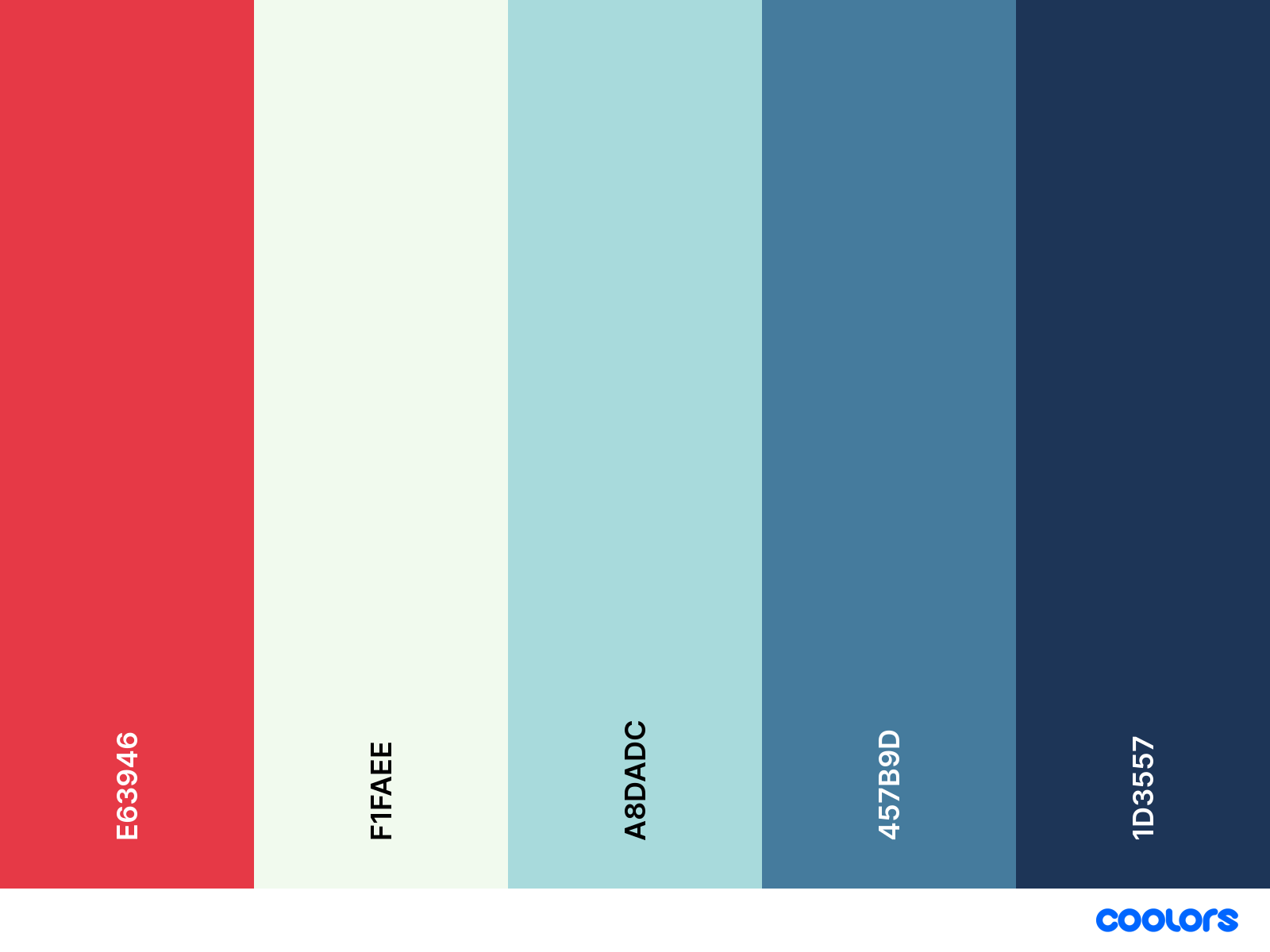
You can find the colour palette on the coolors website at: https://coolors.co/palette/e63946-f1faee-a8dadc-457b9d-1d3557.
I haven’t made full use of all colours in the palette, instead I mainly care about the following 2 colours:
#1D3557- this will be ourPrimarycolour.#F1FAEE- this will be ourSecondarycolour.
Given the above let’s proceed to modifying our colors.xaml file.
Update the Colors.xaml file
For this we need to open the Colors.xaml file located under the Resources/Styles/ folder. Once the file is opened we can replace the current values for Primary and Secondary to the values mentioned above.
The result of our xaml should look as follows:
<Color x:Key="Primary">#1D3557</Color>
<Color x:Key="Secondary">#F1FAEE</Color>
Now we can proceed to making use of these new colours.
Update the Styles.xaml file
For this we need to open the Styles.xaml file also located under the Resources/Styles/ folder.
I have taken a rather drastic approach here and deleted the styles for anything that we won’t be using inside our application, this makes it far simpler to find what we are looking for if we ever need to return to this file. The styles I have kept are for the following TargetTypes:
BorderButtonLabelPage
We then want to modify the Dark and Light values for the majority of the AppThemeBinding entries in this file to use our Primary and Secondary values.
The resulting styles should look as follows:
<Style TargetType="Border">
    <Setter Property="Stroke" Value="{AppThemeBinding Light={StaticResource Primary}, Dark={StaticResource Secondary}}" />
    <Setter Property="StrokeShape" Value="Rectangle"/>
    <Setter Property="StrokeThickness" Value="1"/>
</Style>

<Style TargetType="Button">
    <Setter Property="TextColor" Value="{AppThemeBinding Light={StaticResource Secondary}, Dark={StaticResource Primary}}" />
    <Setter Property="BackgroundColor" Value="{AppThemeBinding Light={StaticResource Primary}, Dark={StaticResource Secondary}}" />
    <Setter Property="FontFamily" Value="OpenSansRegular"/>
    <Setter Property="FontSize" Value="14"/>
    <Setter Property="CornerRadius" Value="8"/>
    <Setter Property="Padding" Value="14,10"/>
    <Setter Property="MinimumHeightRequest" Value="44"/>
    <Setter Property="MinimumWidthRequest" Value="44"/>
    <Setter Property="VisualStateManager.VisualStateGroups">
        <VisualStateGroupList>
            <VisualStateGroup x:Name="CommonStates">
                <VisualState x:Name="Normal" />
                <VisualState x:Name="Disabled">
                    <VisualState.Setters>
                        <Setter Property="TextColor" Value="{AppThemeBinding Light={StaticResource Gray950}, Dark={StaticResource Gray200}}" />
                        <Setter Property="BackgroundColor" Value="{AppThemeBinding Light={StaticResource Gray200}, Dark={StaticResource Gray600}}" />
                    </VisualState.Setters>
                </VisualState>
            </VisualStateGroup>
        </VisualStateGroupList>
    </Setter>
</Style>

<Style TargetType="Label">
    <Setter Property="TextColor" Value="{AppThemeBinding Light={StaticResource Primary}, Dark={StaticResource Secondary}}" />
    <Setter Property="BackgroundColor" Value="Transparent" />
    <Setter Property="FontFamily" Value="OpenSansRegular" />
    <Setter Property="FontSize" Value="14" />
    <Setter Property="VisualStateManager.VisualStateGroups">
        <VisualStateGroupList>
            <VisualStateGroup x:Name="CommonStates">
                <VisualState x:Name="Normal" />
                <VisualState x:Name="Disabled">
                    <VisualState.Setters>
                        <Setter Property="TextColor" Value="{AppThemeBinding Light={StaticResource Gray300}, Dark={StaticResource Gray600}}" />
                    </VisualState.Setters>
                </VisualState>
            </VisualStateGroup>
        </VisualStateGroupList>
    </Setter>
</Style>

<Style TargetType="Page" ApplyToDerivedTypes="True">
    <Setter Property="Padding" Value="0"/>
    <Setter Property="BackgroundColor" Value="{AppThemeBinding Light={StaticResource Secondary}, Dark={StaticResource Primary}}" />
</Style>
I would urge caution in deleting styles like this in case you really do need them. I am sure you will agree that this file is a lot easier to digest now that it only targets the controls that we really care about in our application.
We have one more change to make.
Hiding the Shell navigation bar
This is a small change but makes a big difference for the application style that we are going for. We do not need a big bar at the top of our application. We have actually almost completely implicitly hidden it through the deletion of the Shell related styles however it would still be sitting at the top of our application displaying the Title of each page presented.
In order to hide this we can add the following line into the constructor of the AppShell.xaml.cs file:
Shell.SetNavBarIsVisible(this, false);
I like to put this code in here because it does relate to the Shell for the application. Just to confirm our constructor should now look as follows:
public AppShell()
{
    InitializeComponent();

    Shell.SetNavBarIsVisible(this, false);
}
That is it for the changes in this post. Let’s proceed to checking out what impact they make.
Taking our application for a test drive
If we now run our application we will see the following pages based on whether we are running in light or dark mode.
| Light mode | Dark mode |
|---|---|
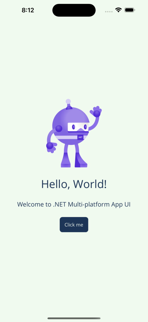 |
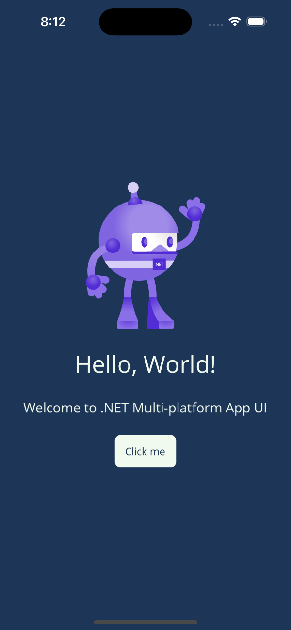 |
What we have achieved
To summarise what we have achieved in this post:
- Created our project.
- Applied our colour scheme.
- Hidden the Shell navigation bar
- Taken our application for a test drive
In our next post we will look to add in a data layer.
Links
The source for the end of this stage can be found at:
https://github.com/bijington/sliding-puzzle/tree/part-one
| Previous | Next |
|---|---|
| Introduction | Creating our data layer |