Building a sliding puzzle game in .NET MAUI - Part five
by Shaun Lawrence
This post is part of the Building a sliding puzzle game in .NET MAUI series that is aimed at guiding you through building a simple sliding puzzle game in .NET MAUI.
This post is also part of the MAUI UI July community series of blog posts and videos, hosted by Matt Goldman. Be sure to check out the other posts in this series!
What we will be covering in this post
- Creating our level selection page
- Registering our page
- Navigating to our new page
- Taking our application for a test drive
Creating our level selection page
The result of this post will really start to show some great progress, especially in the use of the SlidingTileGrid control that we added in the last post. Let’s proceed to creating our second page of the application.
Creating the LevelSelectionPage
- Right click on the Pages folder
- Click on
Add>New File... - Click on
.NET MAUIin the left hand pane. - Click on
.NET MAUI ContentPage (XAML)in the right hand pane. - Enter the name LevelSelectionPage
- Click on
Add
We should now have a new XAML file open within Visual Studio. We can replace the contents with the following:
<?xml version="1.0" encoding="utf-8" ?>
<ContentPage
    xmlns="http://schemas.microsoft.com/dotnet/2021/maui"
    xmlns:x="http://schemas.microsoft.com/winfx/2009/xaml"
    xmlns:puzzler="clr-namespace:Puzzler"
    x:Class="Puzzler.Pages.LevelSelectionPage">
    <Grid>
        <CollectionView
            x:Name="LevelsCollectionView"
            SelectionMode="Single"
            Margin="50">

            <CollectionView.ItemsLayout>
                <LinearItemsLayout ItemSpacing="20" Orientation="Vertical" />
            </CollectionView.ItemsLayout>

        </CollectionView>
    </Grid>
</ContentPage>
We have added a fairly empty UI for now. The new key component that we are using is the CollectionView which provides a wealth of options for building a collection of items to display on screen and interact with them. For now we have just set the SelectionMode to Single to allow us to handle when a user selects an item in the collection.
Now let’s take a look at how we want our level views to look and then proceed to building that into this CollectionView.
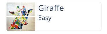
| Light mode | Dark mode |
|---|---|
 |
 |
We can see that we have:
- A border around our view
- A preview of the level on the left hand side
- A title of the level
- A subtitle showing the difficulty
Let’s proceed to adding the template that will define how our items render.
Inside the <CollectionView> element we can add the following:
<CollectionView.ItemTemplate>
    <DataTemplate x:DataType="puzzler:Level">
        <Border
            StrokeShape="RoundRectangle 8,8,8,8">
            <Grid
                ColumnDefinitions="100,*"
                ColumnSpacing="10"
                RowDefinitions="Auto,Auto,*">
                <Label
                    Text="{Binding Name}"
                    Grid.Column="1"
                    FontSize="Title" />

                <Label
                    Text="{Binding Difficulty}"
                    Grid.Column="1"
                    Grid.Row="1"
                    FontSize="Subtitle" />

                <puzzler:SlidingTileGrid
                    Level="{Binding}"
                    IsEnabled="False"
                    TileSpacing="2"
                    Grid.RowSpan="3"
                    WidthRequest="100"
                    HeightRequest="100"/>
            </Grid>
        </Border>
    </DataTemplate>
</CollectionView.ItemTemplate>
Inside the ItemTemplate element we must make use of the DataTemplate element which allows us to define the type of data that this template will be representing. In our scenario this is our Level class that we created in part two.
The remaining parts should look fairly familiar given the list that we created above defining what needed to be inside our view. We have a border, a title Label showing the name of the level, a subtitle Label showing the difficulty and preview of the level using our SlidingTileGrid control.
Modifying the LevelSelectionPage.xaml.cs file
Open up your LevelSelectionPage.xaml.cs file. It should be pretty empty. For now we just want to add in an empty click event handler ready for when we have a second page to navigate to. Modifying the contents to match the following:
namespace Puzzler.Pages;

public partial class LevelSelectionPage : ContentPage
{
    public LevelSelectionPage(Context context)
    {
        InitializeComponent();

        LevelsCollectionView.ItemsSource = context.Levels;
    }
}
Here we are just setting the ItemsSource property of our CollectionView to be the list of levels that we have populated inside our Context class. Note that we have also added a dependency to Context by including it as a parameter to our constructor. Thankfully Shell will automatically resolve the instance of Context for us, so long as we register the LevelSelectionPage with the MauiAppBuilder so let’s proceed to doing that.
Registering our page
In order for Shell to know how to navigate to our page we need to define the routing information. Let’s open up the MauiProgram.cs file and add the following lines into the CreateMauiApp method:
// Register the pages.
builder.Services.AddTransient<LevelSelectionPage>();

// Register the routes to the pages.
Routing.RegisterRoute(nameof(LevelSelectionPage), typeof(LevelSelectionPage));
Navigating to our new page
Our final change is to open up our HomePage.xaml.cs file and modify the OnPlayButtonClicked that we added in part three to the following:
async void OnPlayButtonClicked(object sender, EventArgs e)
{
    await Shell.Current.GoToAsync(nameof(LevelSelectionPage));
}
Now when the user interacts with the play button they will be navigated to our newly create LevelSelectionPage. Let’s go and see this in action.
Taking our application for a test drive
If we run the application we will see the home page and then tapping on the play button will show following pages based on whether we are running in light or dark mode.
| Light mode | Dark mode |
|---|---|
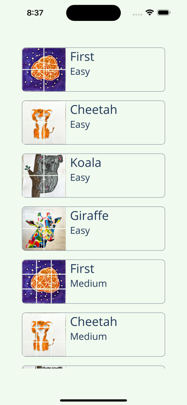 |
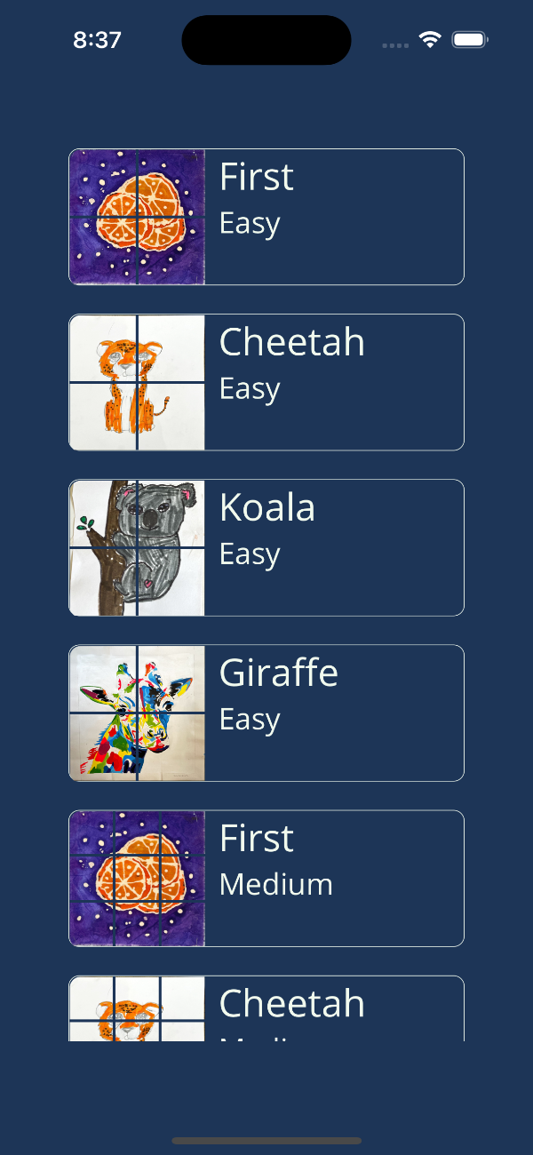 |
What we have achieved
To summarise what we have achieved in this post:
- Created our level selection page
- Registered our page
- Navigated to our new page
- Taking our application for a test drive
In our next post we will look to add in our level page.
Links
The source for the end of this stage can be found at:
https://github.com/bijington/sliding-puzzle/tree/part-five
| Previous | Next |
|---|---|
| Creating our tile grid | Creating our game page |